
UX Designer based in Pune, India
Route
Route is an employee transportation management app procured by companies for the transportation of their employees. The current UI was outdated compared to the competitors and employees found the app frustrating to use because of the tedious processes within the app to achieve their goals. Further frustrations from the employees can lead to companies searching for a new vendor.
I decided to redesign the app to make it more user-friendly by streamlining various tasks within the app.
User Research
I began the redesign process with user research. To understand the users' problems I conducted a contextual inquiry which would provide me with qualitative data. I also gathered quantitative data through questionnaires.
Contextual Inquiry
I conducted user interview to understand how various tasks are performed on the app. During the interview, I observed how the participant created a weekly cab roster and how he tracked the cab. I also took notes of the comments and remarks made by the participant while using the app.
"As my pick up is from home and drop is to home why is that option there? It is by default the same and I am wasting my time choosing the only option."
- a remark made by the participant while using the app
Quantitative Research
I collected quantitative data from 20 users through a questionnaire.
-
70% of the reasons cited by the users for missing their cab was delayed location tracking.
-
2 of 4 users found the check-in/out pin difficult to find within the app.
-
4 of 5 users were unaware of the announcement section on the home screen.
Insights
-
Users generally tracked cabs while walking from their home to their cab boarding point. This action required them to switch their focus between paying attention to the street and searching/selecting UI elements on the app.
-
The current UI implemented a carousel to provide important transport updates. Over time users developed 'banner blindness' and now completely ignore it.
Task Analysis
Goal: Track cab and check-in and check-out
During my user research, I observed how users tracked their cabs and how they checked in and out of it. Based on this I created a user flow to identify frictions in performing the above tasks.
Persona

Name: Harshad
Age: 29 Years
Gender: Male
Occupation: Accountant
Marital status: Single
Harshad's story
I am an accountant in a multinational financial firm and I've been working for the last six years. I live far from my company and I rely on my company's transport as there is no direct public transportation from my home to the office.
I have to be very punctual about my time. If I miss my cab I have to use public transport which is painstaking and more time-consuming. To be on time I have to ensure there is clear and efficient communication between me and the driver.
Occasionally I have to stay back late at work and the only transport available is the one provided by his company.
Wireframes
I created the low-fidelity concepts for primary use and tested it with users. After testing initial concepts and gaining feedback from the users I made minor changes to the design and then proceeded with designing the high-fidelity designs.
Design Solution
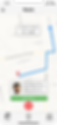
One Tap Cab Tracking
The newly designed home page now directly opens to vehicle tracking, which provides information such as the cab's location and it's ETA, driver and vehicle details and the trip pin for check-in/check-out.
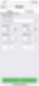
Quick rostering
Rostering can now be done more quickly by eliminating non-value options. The new design implements a picker instead of drop-down menus for login and logout time, reducing the errors in rostering and making it more accessible.
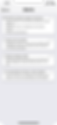
Alerts
Users no longer have to rely on emails for their company's transport updates. Route app now allows employers to directly communicate all important transport news and updates via app ensuring that no update is missed by the employees.

Trip notifications
Users will now be alerted of their cab's arrival via notifications. This will reduce the waiting time for drivers and will further reduce the chances of employees missing their cabs.
User Testing
I tested my low-fidelity prototypes with users and observed how they interacted with the new designs and elements. Based on those observations I made further improvements to my design and proceeded with a high-fidelity interactive design.